Redesigning Yelp’s mobile web restaurant discovery
Introduction
Note: This design challenge was done as part of an internship application. I opted to do the UX exercise which suggested low-fidelity wireframes as the final deliverable. I am not employed by or affiliated with Yelp in any way.
Redesign how someone explores nearby restaurants on Yelp’s mobile website
As a semi-regular user of the Yelp app, I have had a few ideas in the past of ways to improve the app experience. I was excited to take a closer look at the mobile web experience and explore ideas for improvement.
Step 1: What’s the Problem?
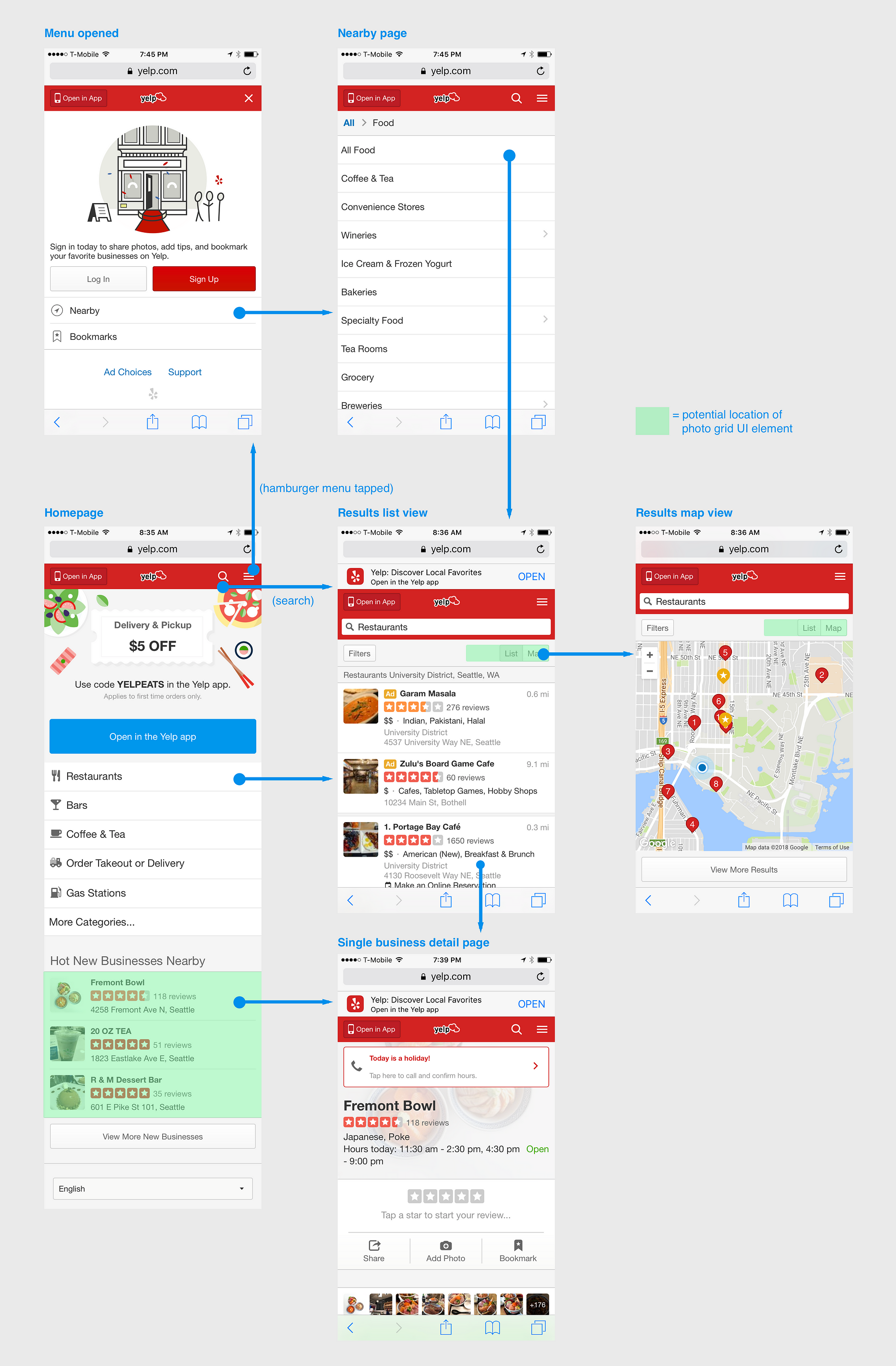
I started off by doing a critique of the current mobile web experience and how a user can explore nearby restaurants with the current design.
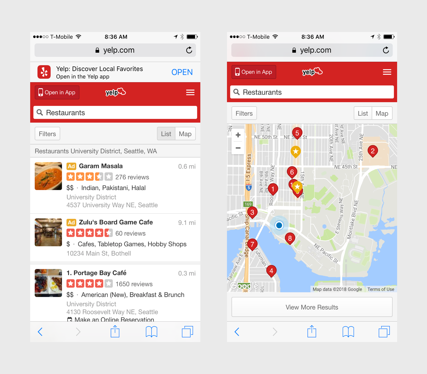
The screens above reveal two primary ways to discover a new place to eat: scrolling through a list or exploring by location on a map.
The screen on the left provides more details upfront about a restaurant (distance away, number of reviews, price, type of cuisine, address). The one on the right provides location relative to the user with the option to view the same details provided upfront in the other design when a location marker is tapped.
These designs assume that the following factors are most important when deciding what to eat:
- location
- distance from user
- number of reviews
- price range
- cuisine type
Two questions arise from this:
Are there more factors that impact a user’s initial choice and interest in a restaurant?
Are there more interesting methods to discover local restaurants based on these factors?
I explore these two questions in the following two sections.
Step 2: Who am I Designing For?
In order to get a better sense of user needs, I usually conduct some initial exploratory user research with people I know. But due to time constraints while working on this project, I relied on existing user research I could find regarding factors affecting where people choose to dine.
Survey
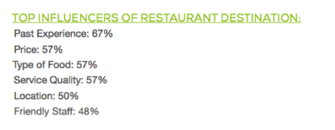
I came across survey data from Toast, a cloud-based software company based on Boston that provides restaurant management and POS systems. This was a national survey from 2015 to better understand millennials’ attitudes towards dining out.
The survey had a list of factors that participants had to rank in terms of importance for deciding on a place to eat at.
Interviews
One factor that is missing from the list above that Yelp includes in their experience is photos at food. I looked for research on the impact that food photos play in choosing a restaurant and found the following quotes from this article:
“All my friends check out a restaurant’s Instagram page to see what we want when we go out for a meal”
“Knowing what a dish looks like is really important when deciding what to order…so I always go on Instagram first — not just the restaurant’s page either but the geotag and sometimes the hashtag too”
“I like to check the tagged location pictures on Instagram to see if I’ll be able to take an aesthetically pleasing photo”
“If I see a post on Facebook or Instagram or a delicious looking burger or fondue, I’ll search out where it’s from”
My conclusion from this research is that Yelp has thoroughly researched what factors are important to users exploring where to eat with their current mobile web (and app) interface. Service was a factor brought up in the survey that is not explicitly displayed in Yelp’s UI, but the 5 star rating intends to cover this factor.
Photos of food as a primary method of restaurant discovery remains unutilized by Yelp. Even though there is a thumbnail image in the list view of restaurants and images on the profile page, there are a variety of design solutions to incorporate photo-based discovery of restaurants into the UI to make it more interesting and engaging for the user.
Step 3: Exploring Solutions
Inspiration
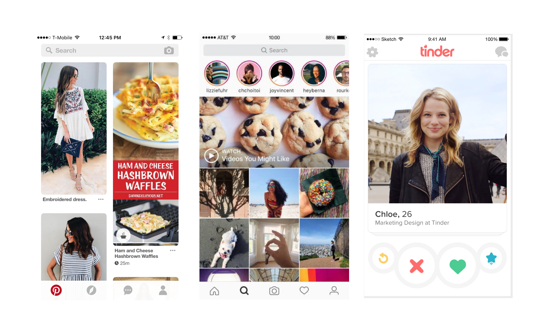
I thought about other apps that rely on photo-based discovery and three immediately came to mind: Pinterest, Instagram, and Tinder.
I took inspiration from these apps for the main discovery page of my explorations, but then thought through the high level flow to get to a list of restaurants or a map based view from there.
Ideation
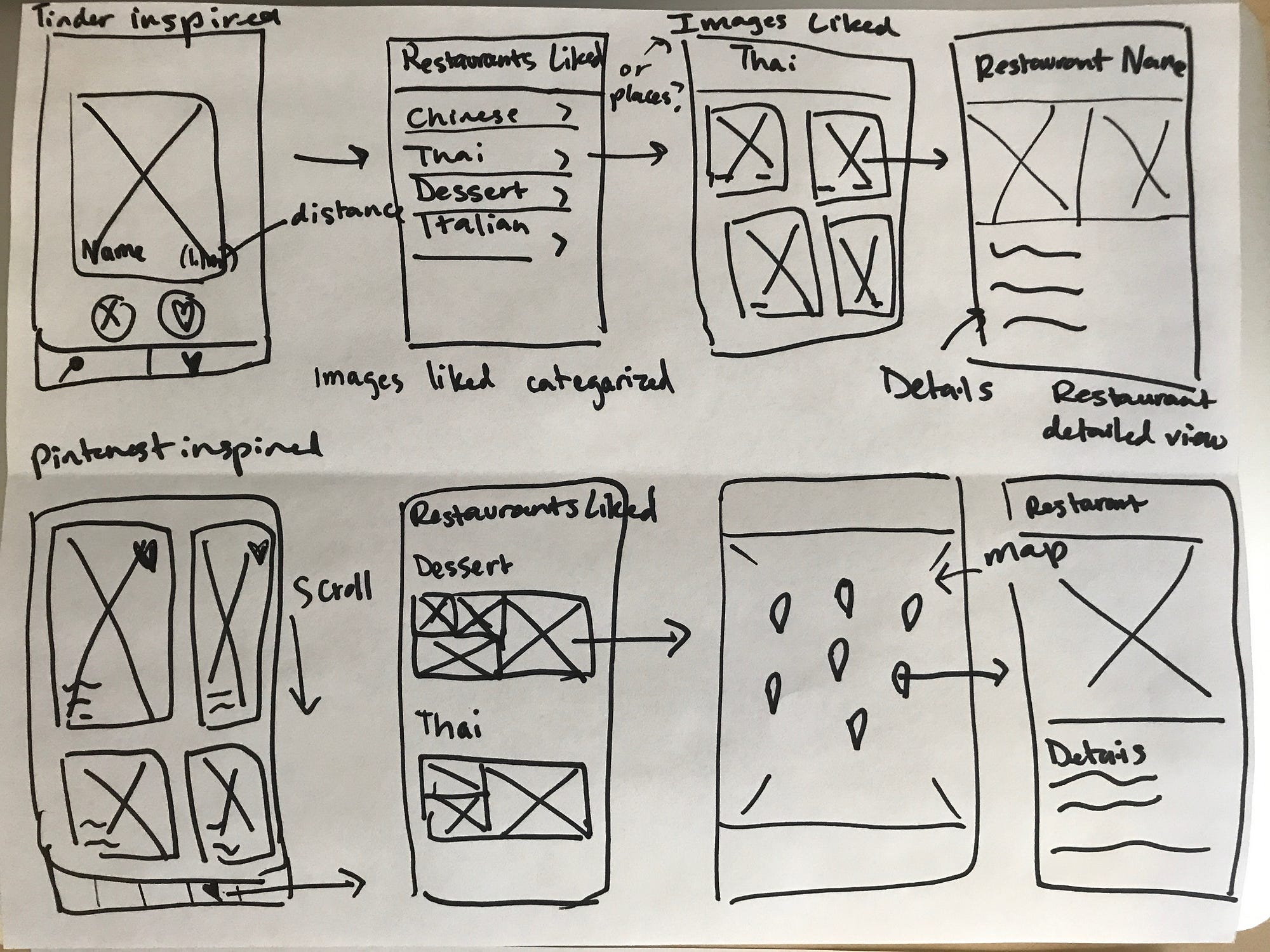

Choosing a design direction
After sketching some ideas, it was time to narrow down on a design direction and figure out how to incorporate photo-based exploration into Yelp’s existing mobile web UX. I decided on a a hybrid of the Pinterest and Instagram photo grid based discovery because Tinder’s swiping on a single photo interaction is very much associated with their app and I did not want the user to be distracted by this fact.
Another reason I did not want to use single photos on the main discovery page was because Yelp prioritizes showing quantity of results over focusing on a single business, as is seen with the many location markers on a map view, as well as the lists view featuring multiple businesses on their results page.
Thinking about the existing UX
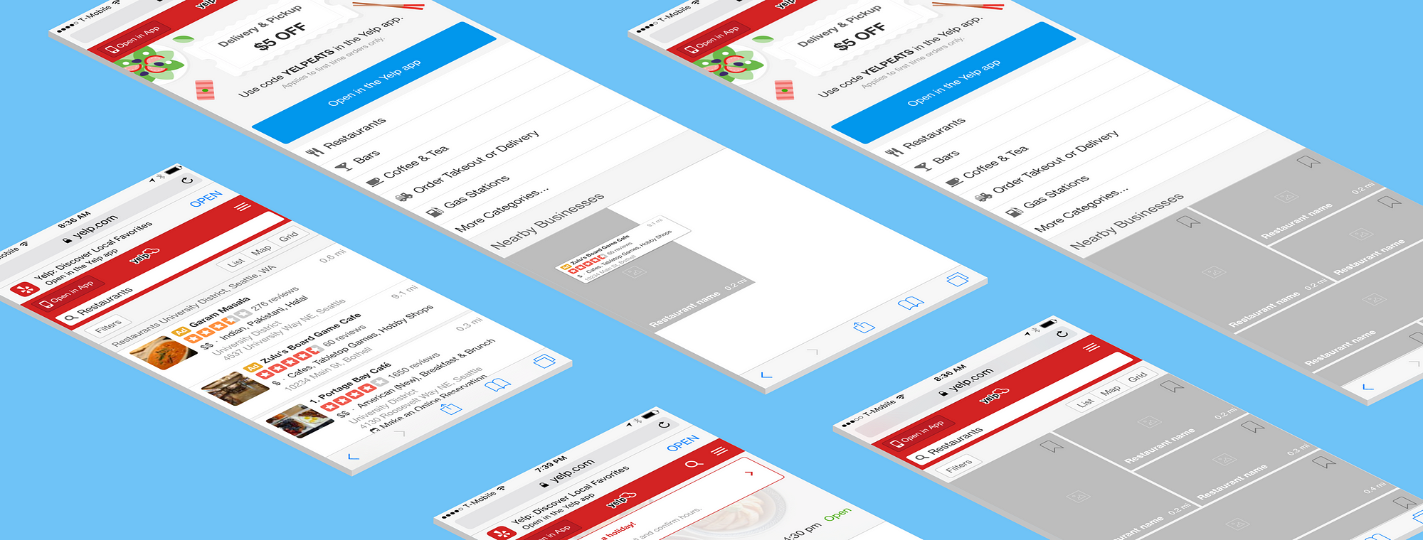
Now it was time to incorporate the photo grid discovery feature into the existing user experience. To help with this, I created a UX flow of the current mobile web user experience highlighting the key ways a user might explore local restaurants.
I don’t think that Yelp would get rid of their list and location based discovery since that is a key part of their UX flow in the mobile website and in their app. Thus, I thought about where it would make sense to integrate the photo grid features (areas highlighted in green).
Step 4: Wireframes
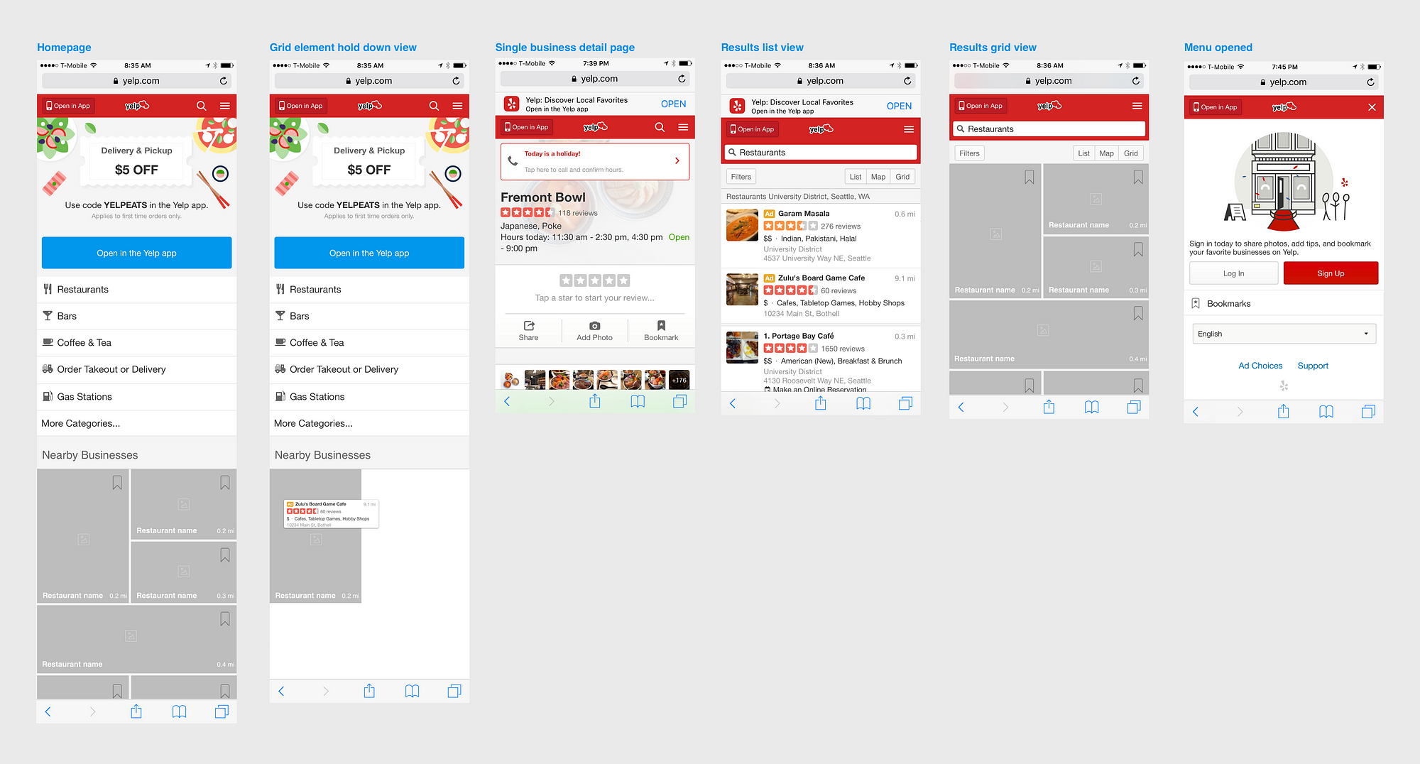
Next, I replaced the green areas with my photo grid related wireframe UI elements and also moved a couple of other elements around, which I explain below.
Changes I made:
- Added photo grid under a section called Nearby Businesses on the homepage
- Added new screen for the photo grid element (called ‘Grid element hold down view’)
- Got rid of ‘Nearby’ from the hamburger menu because it created a circular loop and the same categories should be shown under “More Categories” on the homepage
- Moved language selection dropdown under hamburger menu instead of keeping it at the bottom of the homepage
- Added option to view search results or business category selection results in a photo grid view (in addition to the list and map) option
Updated UX Flow
The interaction flow depicted below shows only the updated screens and screens that are part of the photo grid flow. I left out the list and map search result views.
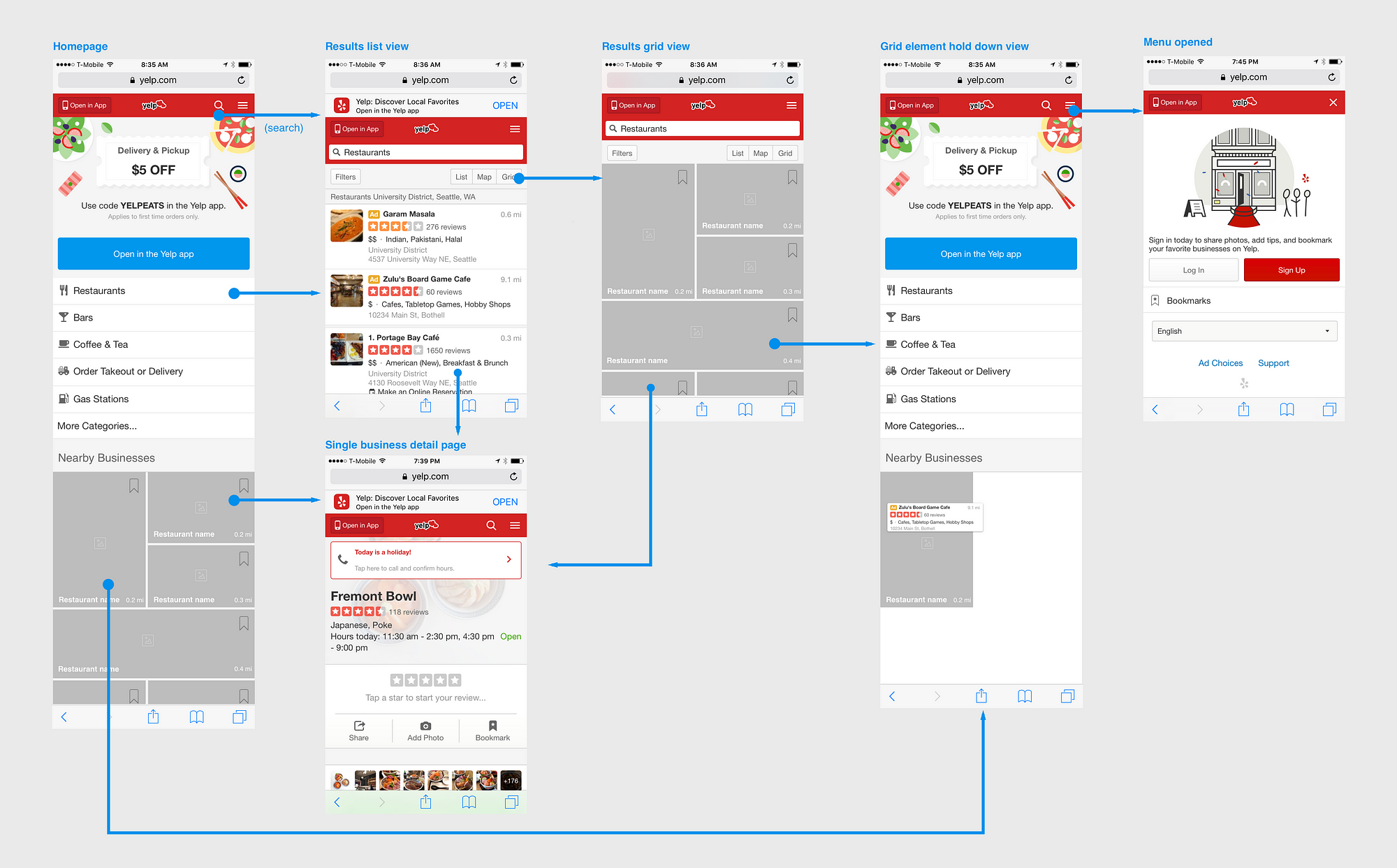
Photo-based exploration of local businesses provides a more engaging way for users to explore local businesses rather than scrolling through categories and list views of restaurants or having to tap markers on a map. Photo-based discovery would not only be useful for restaurants, but also for the other types of businesses. For example, if someone were looking for a nail salon, they would ideally see images of manicures in the photo grid view.
A note for consideration
The success of photo-based exploration is largely dependent on high quality images being featured. While some Yelp reviewers have great photos that they upload in reviews, not all photos on Yelp are great, especially those posted for businesses that are not food related. Perhaps Yelp could consider offering professional photography services for businesses, similar to what Airbnb does for their listing hosts.
Higher quality images would be useful for redesign considerations of Yelp’s delivery or takeout order feature within the mobile app as well.
Conclusion
In this case study, I used research and data to gain a better understanding of the problem space and then explored a variety of different interface designs to integrate photo-based discovery into the Yelp mobile web experience.
I began by defining the problem and then found user research in the form of surveys and interviews. I then sketched out high level flows of different photo discovery options and moved into slightly higher fidelity wireframes in Sketch as my final deliverable.
Going through this exercise allowed me to reflect on my design process and figure out what could be improved. If I had more time, I would have wanted to carry out my own user research and usability test a paper prototype of my wireframes.